Just like brands have colors, materials and finishes that represent their DNA, the design features and aesthetics of the lettering they choose for their logo contributes to their brand’s personality. Whether companies are creating, maintaining, or refreshing their brand identities, they are strategic about the typefaces they choose, as well as any logo modifications they make. Typography has meaning and creates feelings in consumers as they experience a brand’s logo. At LaFrance, we create name plates ensuring that font details are processed with precision, maximizing the logo’s connection to the consumer.
Font types describe the style and size of the lettering in a typeface design. There are five basic font categories, each one expresses a different emotion depending on its distinctive look.
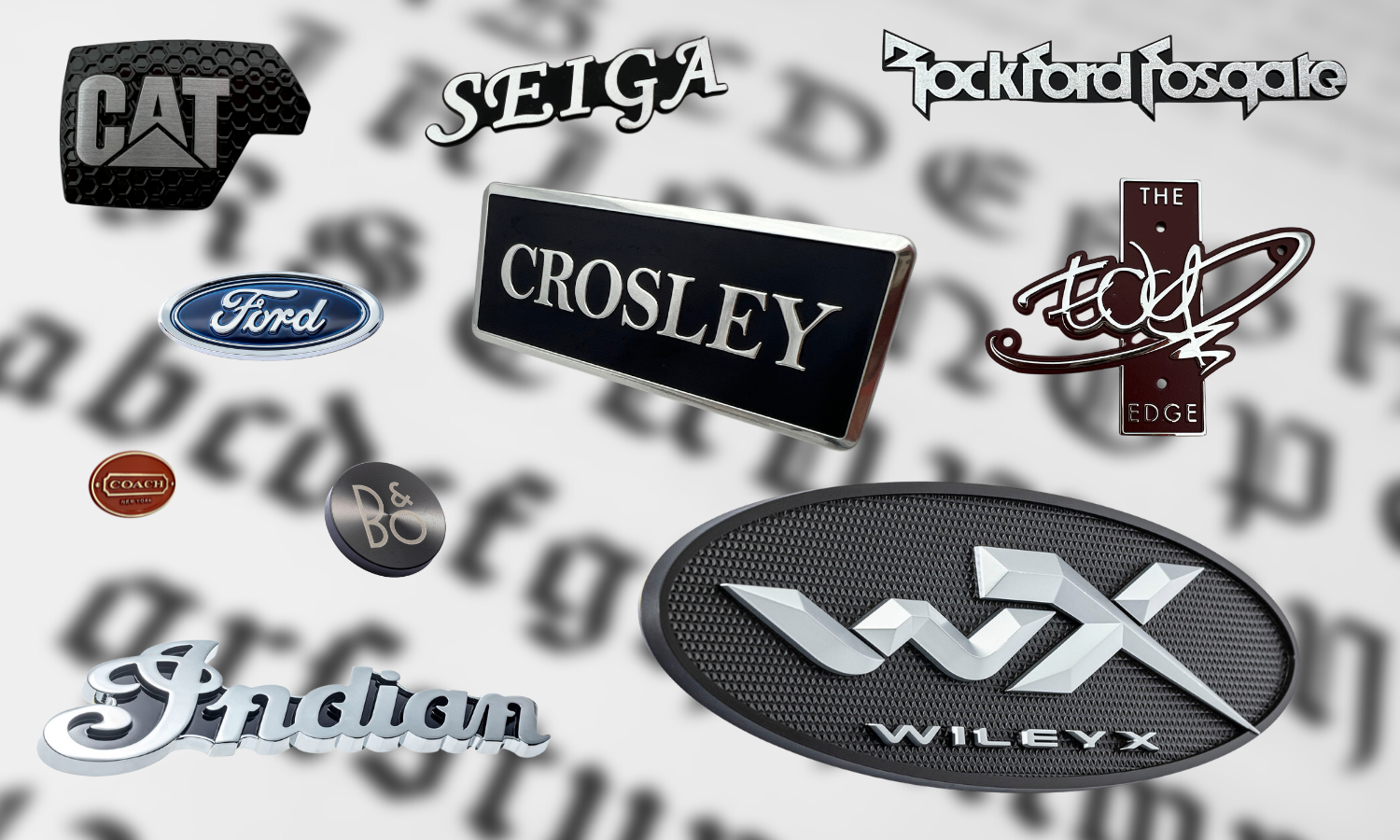
SERIF fonts have decorative projections, or tapers often at the end of a letter stroke (Coach, Tiffany & Co.). They feel classic, traditional, and trustworthy. For example, Tiffany & Co.’s typeface (Baskerville) is a serif font that speaks to the sophisticated brand, especially when accompanied with the company’s iconic Tiffany Blue color.
SLAB SERIF fonts (VOLVO, SONY) have thick, block-shaped serifs that are bold and exude power, performance, and confidence. Varsity lettering is a classic example of slab serif, after all, these letters are given out for superior sports performance.
Sans Serif fonts (Jaguar, Google) are literally sans (without) serifs, these modern typefaces have clean lines that are easy to read. Google uses a bold sans serif font that is simple and geometric, yet has the added memorable flair of the blue, red, yellow, and green letters. Easy-to-read suggests ease of use and no one can argue that Google makes searching for information easy.
Script typefaces (Ford, Coca-Cola, Cadillac) emulate handwriting and exhibit movement, with styles ranging from formal and elegant to causal and fun. The world’s most memorable logo, Coca-Cola, has been used (with some minor tweaks) since 1887. It utilizes the Spencerian script typeface, and for those of us who remember the Coca-Cola campaign from the 1970s, “Coke Adds Life” there’s no doubt that this timeless script style shows the same energy and uniqueness that the brand communicates to this day.
Display/Decorative fonts (Disney, LEGO) are creative, artistic, and playful. These logo designs often combine different types of customized font styles that draw attention and create distinctive and memorable visuals.
It is imperative that the distinctive characteristics and minute details - like the letter weight, stroke width and spacing- of a brand’s logo are executed precisely and consistently across all touchpoints. Not only does this support the brand’s aesthetic goals, but it ensures brand protection and authenticity. Consumers will trust that they are purchasing your product, and not a counterfeit.
Just like LaFrance can color match a brand’s iconic hue and replicate authentic textures that speak to its DNA, we ensure the integrity of a brand’s typeface design in its emblem. LaFrance can execute the strictest typography and font guidelines for name plate styling. From the tiniest eyewear part to the biggest construction equipment logo, precision is carried through regardless of part size.
Are you ready to put your best typeface forward with precision processing and superior logo details? Please complete our form below. We can't wait to hear from you!


Leave Comment