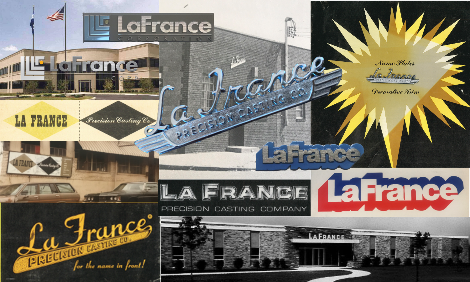
Every brand is dynamic, and as companies change and grow, they often revamp their logo to connect with consumers, reflect new values or offerings, or commemorate a milestone. At LaFrance, we have supported brand makeovers for some of the world’s biggest (and oldest) brands. After 77 years, we have experienced multiple redesigns of the “face” of our own brand. Here’s a look at the evolution of our logo and how LaFrance’s identity has incorporated design trends and communicated capabilities and core values while recognizing company milestones.
LaFrance was founded in 1946 and in 1950, moved into a larger manufacturing facility. The business had successfully transitioned from making jewelry to creating nameplates for the automotive dealer industry. Therefore, it’s no surprise that the logo embraced the script style of LaFrance Jewelry Company women’s name pin designs, as well as the 1950s typography typically seen in car branding.
For fans of the Madmen TV series, the next iteration of the LaFrance logo should resonate. The Mid-century modern refresh created in 1956 had the geometric influences that were popular at the time. Diamond shapes were prolific in design, and LaFrance stayed on trend with this logo update after 10 years in business.
In 1966, LaFrance celebrated its 20th Anniversary with new offices and manufacturing facilities. This logo was created with the bold dimension and metallic appearance that defined the aesthetic appeal of a zinc die cast nameplate.
In 1976 LaFrance turned 30, and like any thirty-year-old would in the 70s, the logo received a far-out makeover. Thick font shadowing was a graphic trend that defined the times (just think of how many times you’ve seen the word Groovy with a drop shadow). For LaFrance, this effect also spoke to our manufacturing process, with a text that popped as if it was being cast from a “mold” in the background. The Spirit of ’76 influenced the logo design as well. From cars, to clothing, to our company logo – the celebration of America’s bicentennial year had the entire country embracing red, white, and blue color combinations.
Our current LaFrance logo, at 25 years old, is the one with the most staying power. Designed in 1998 to commemorate the opening of new LaFrance headquarters, the logo includes a meaningful “L-ements” graphic. The four silver “L-ements” represent the cornerstones of LaFrance: Family, Growth, Leadership and Creativity. The gold circle symbolizes that these cornerstones are core values of the company, central to the philosophy and success of LaFrance.
Whether you’re considering a logo refresh or looking to enhance the aesthetics of your current branding, please complete the form below to learn more about how LaFrance can work with you to elevate your image.


Leave Comment